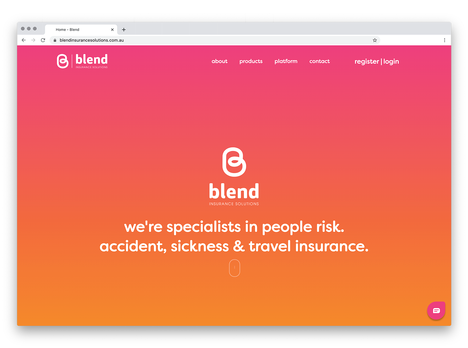
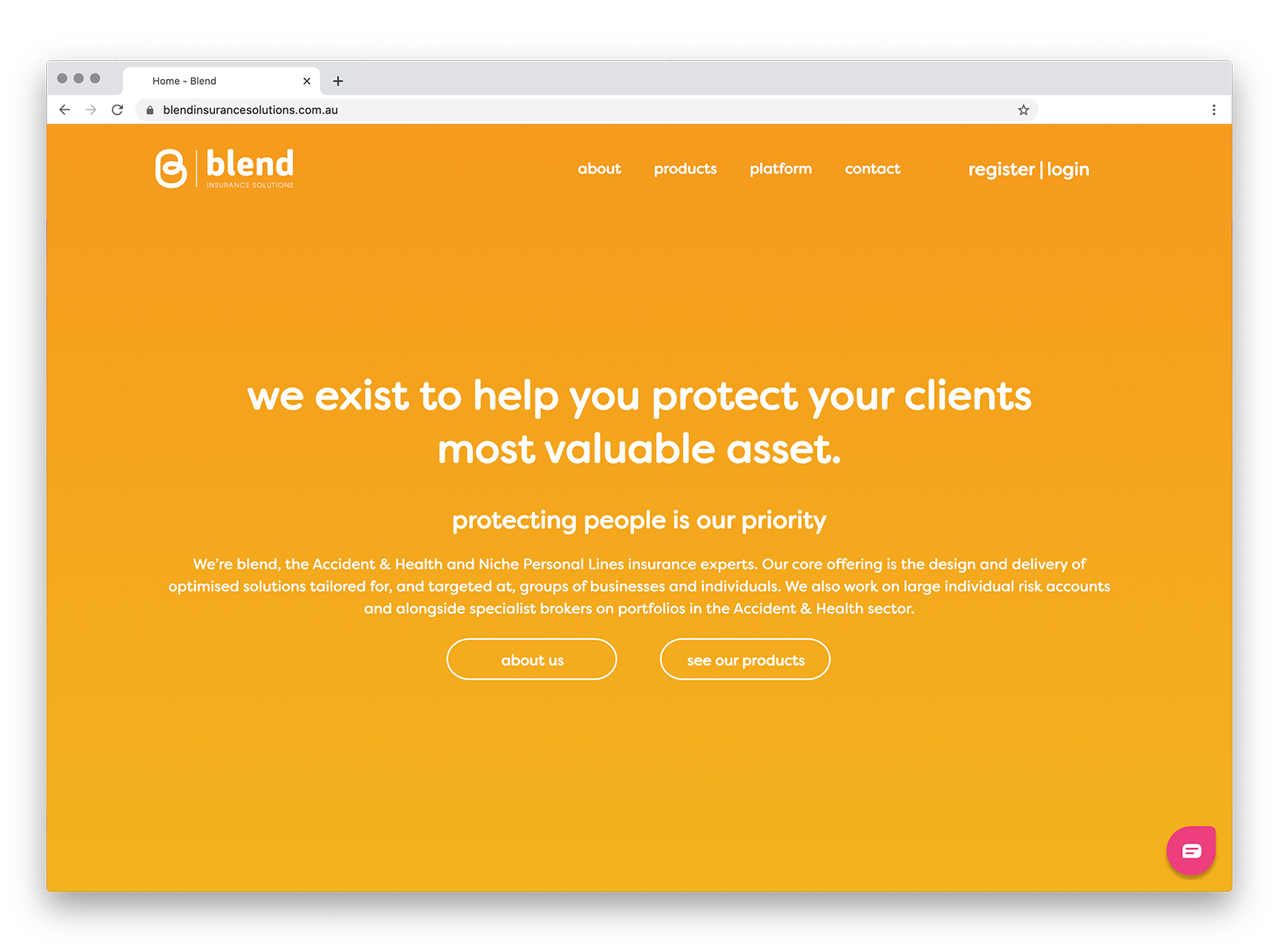
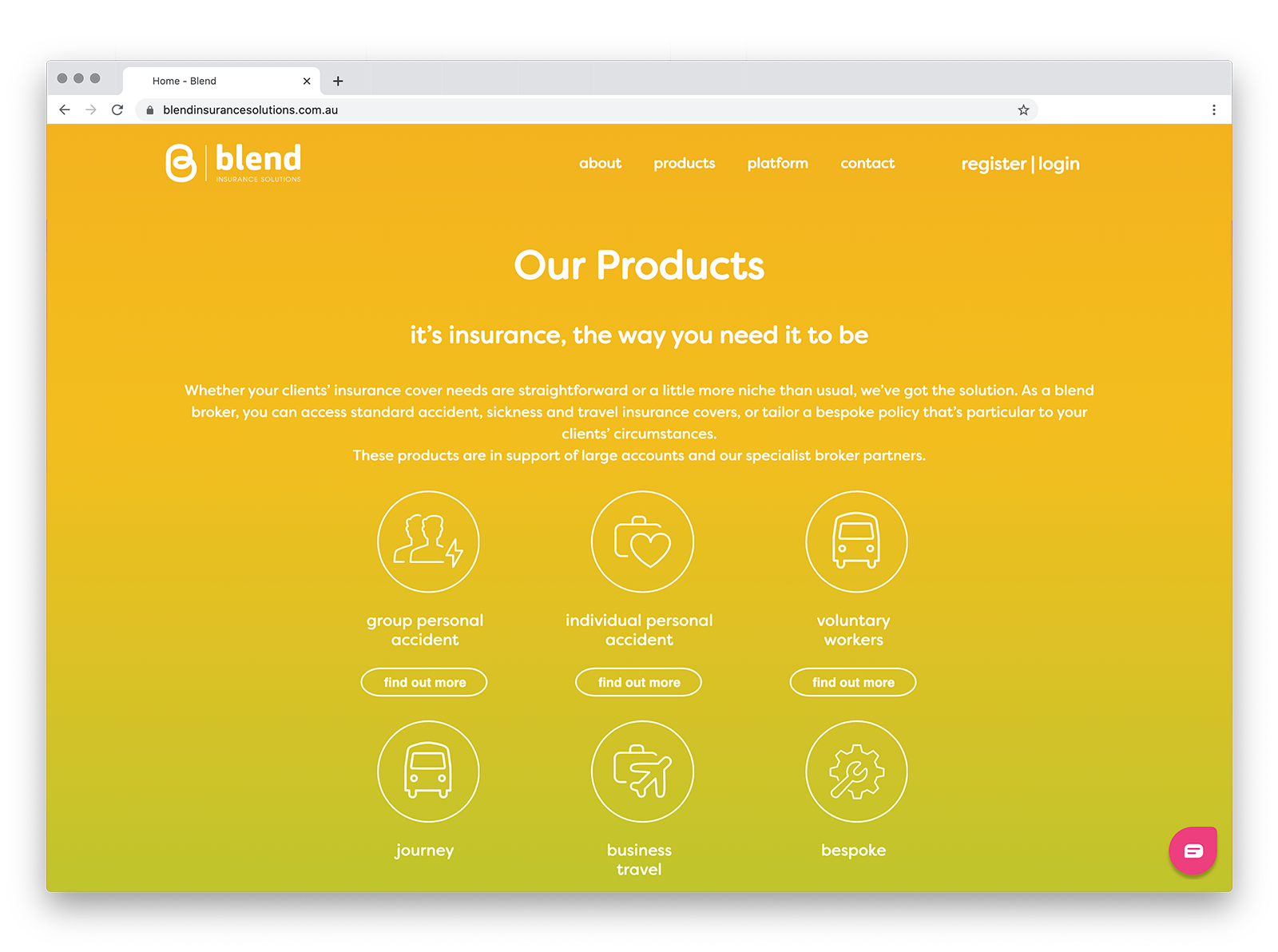
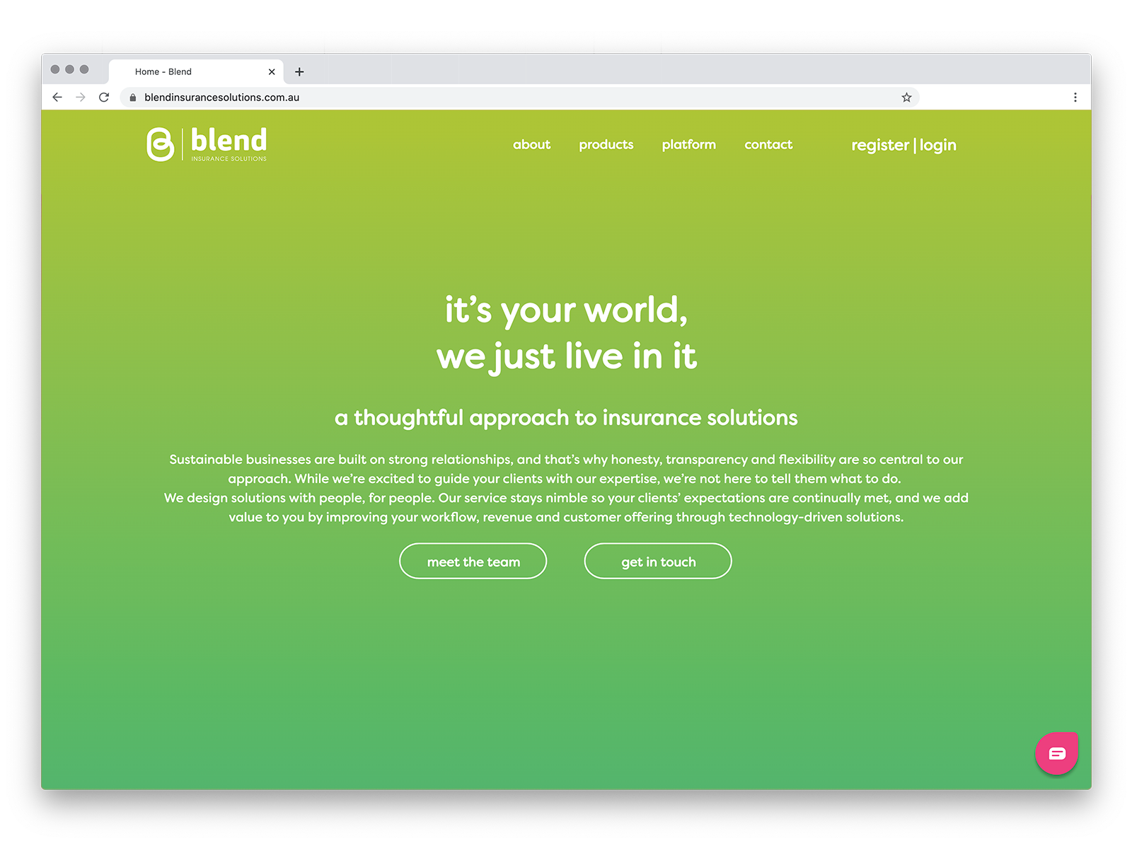
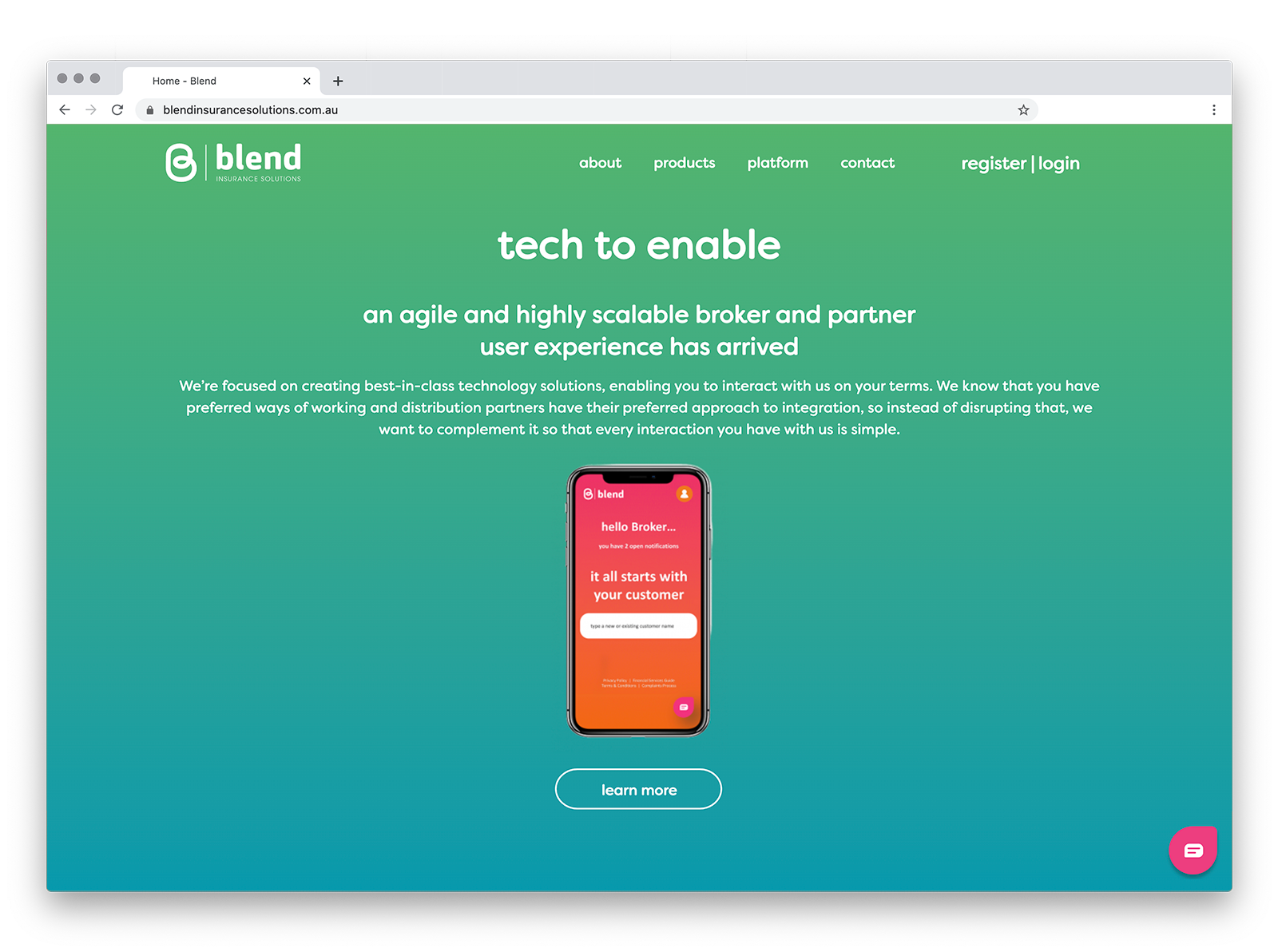
Blend was an insurance startup that was looking to make a splash. Whilst their product wasn’t quite ready, they needed a holding site that would let them tease prospective clients with what was to come.
Having worked on their visual identity we knew how to communicate this brand online. We conceived a site that felt as fresh as the insurance product they were creating. A site that felt alive with smarts such as the AI-driven product would be. A site that felt as friendly as a startup in the insurance space should be.
