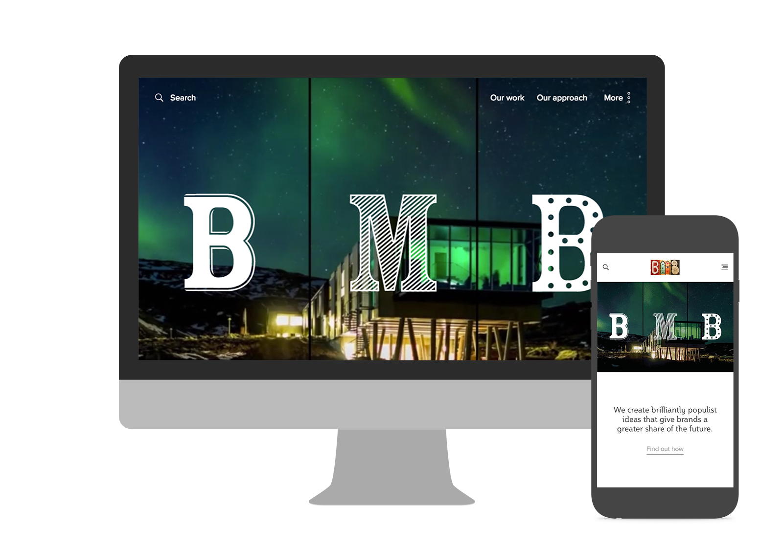
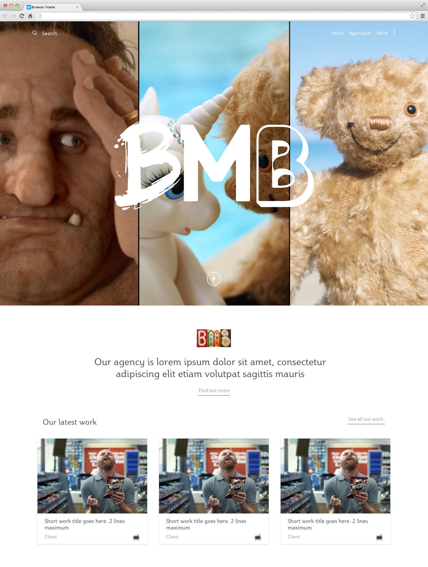
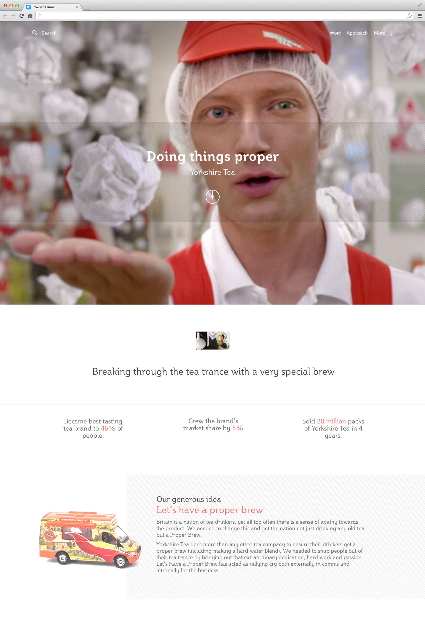
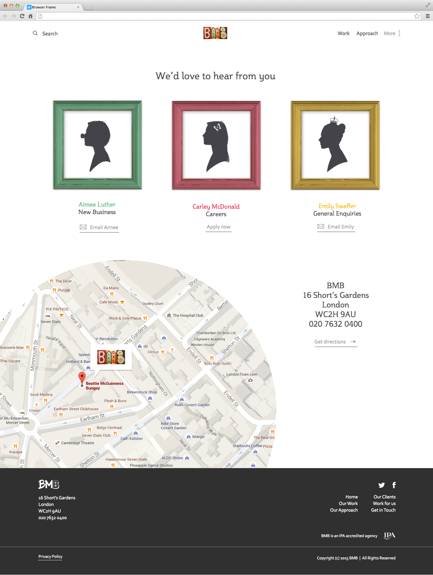
The agency I was working at, BMB, were looking to refresh their website to better reflect the agency and its culture. We needed to address key areas such as case study pages and the contact form.

BMB staff each have a unique business card with each letter a different photo that resembled it. I wanted to take this thought through to the website using a three-way split screen video in the header. Because good things come in threes.


